Logo · Signage · Stationery
Wright Architects
A wordmark built on a single precise cut — an identity as considered as the practice it belongs to.
The Challenge
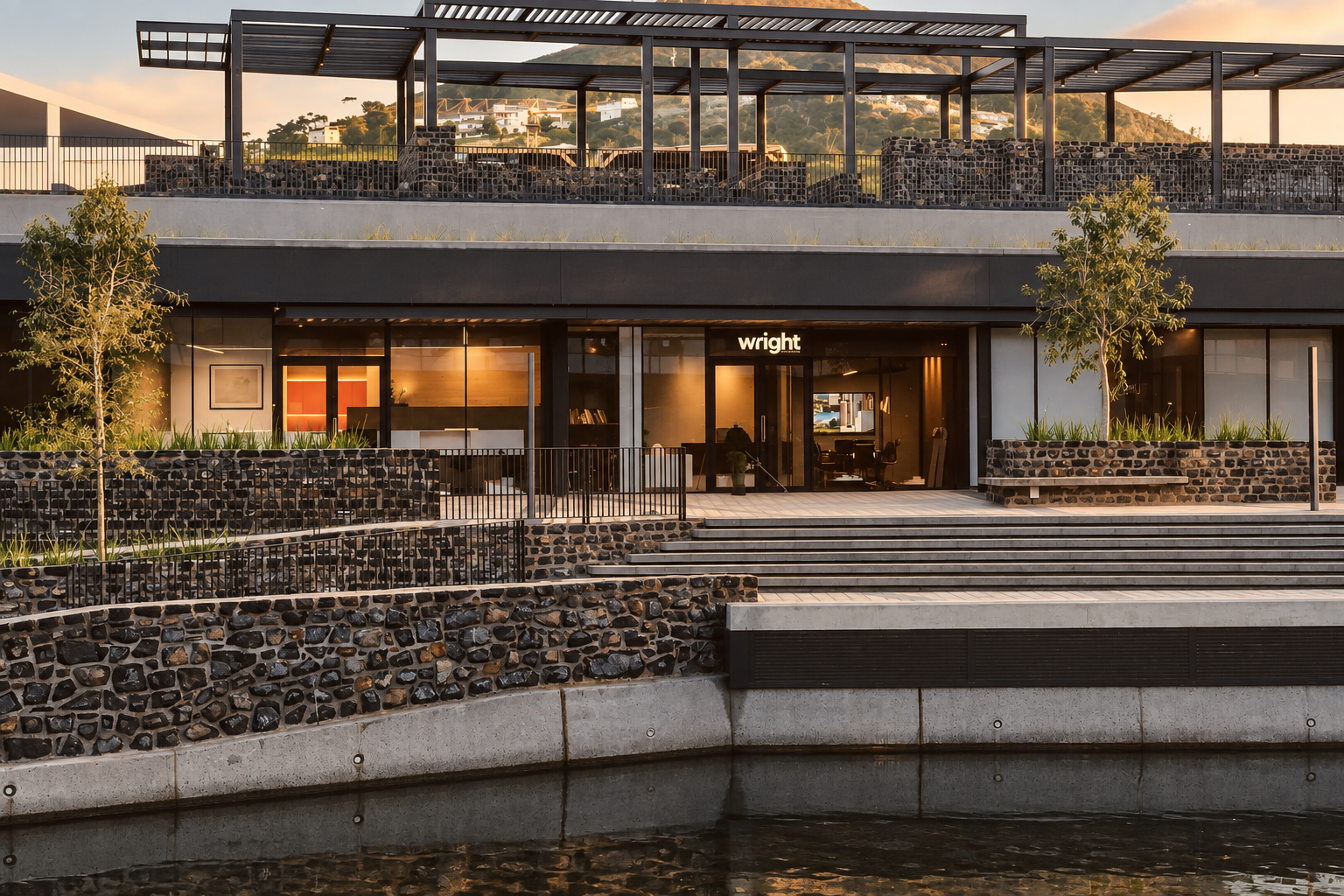
Wright Architects needed a mark that could sit on a waterfront office front, a business card, and a set of drawings alike, and read as exactly what the practice is: precise, considered, unshowy. Nothing about it could look decorative — every line had to earn its place. I worked alongside creative director Warren van Rensburg, who helped shape the brand's positioning, strategy, and creative direction.

Brand Story
Surgical Precision

The Approach
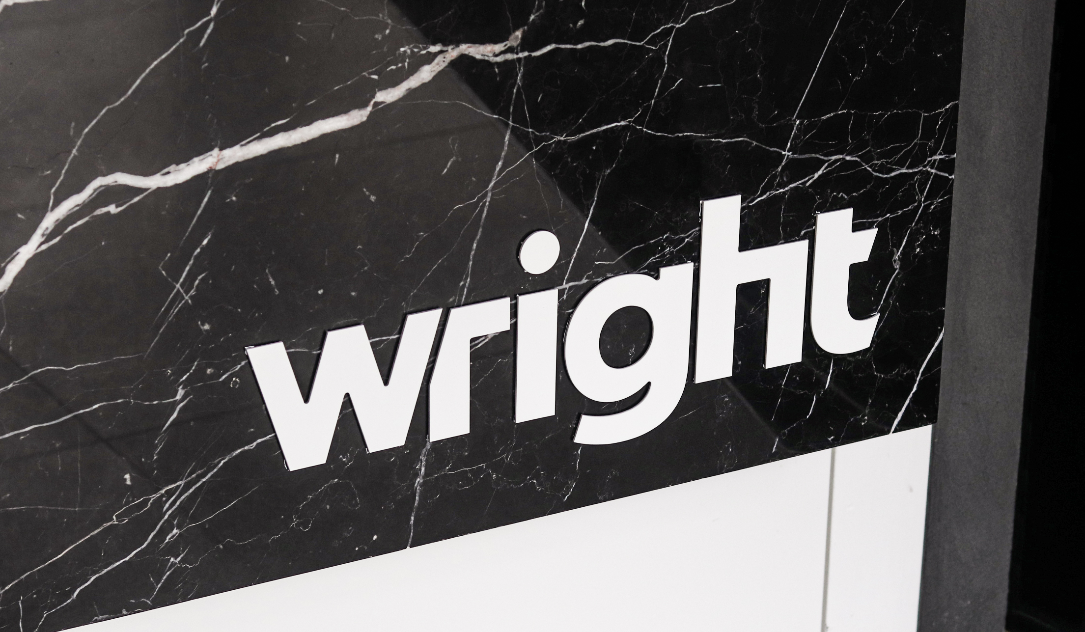
The whole identity turns on a single decision: every terminal in the wordmark is cut at exactly 17.5°, the same angle, repeated without exception. Set it against a straight edge and the cut all but disappears — subtle enough that most people will never consciously clock it. Soften those terminals back to a plain 90°, though, and the mark goes flat: it loses the quiet tension that makes it read as drawn, not typed. That's "surgical precision" in one detail — a cut small enough to go unnoticed, essential enough to hold the whole structure together. The kind of exactness a good architect works in without ever pointing at it.
The Outcome
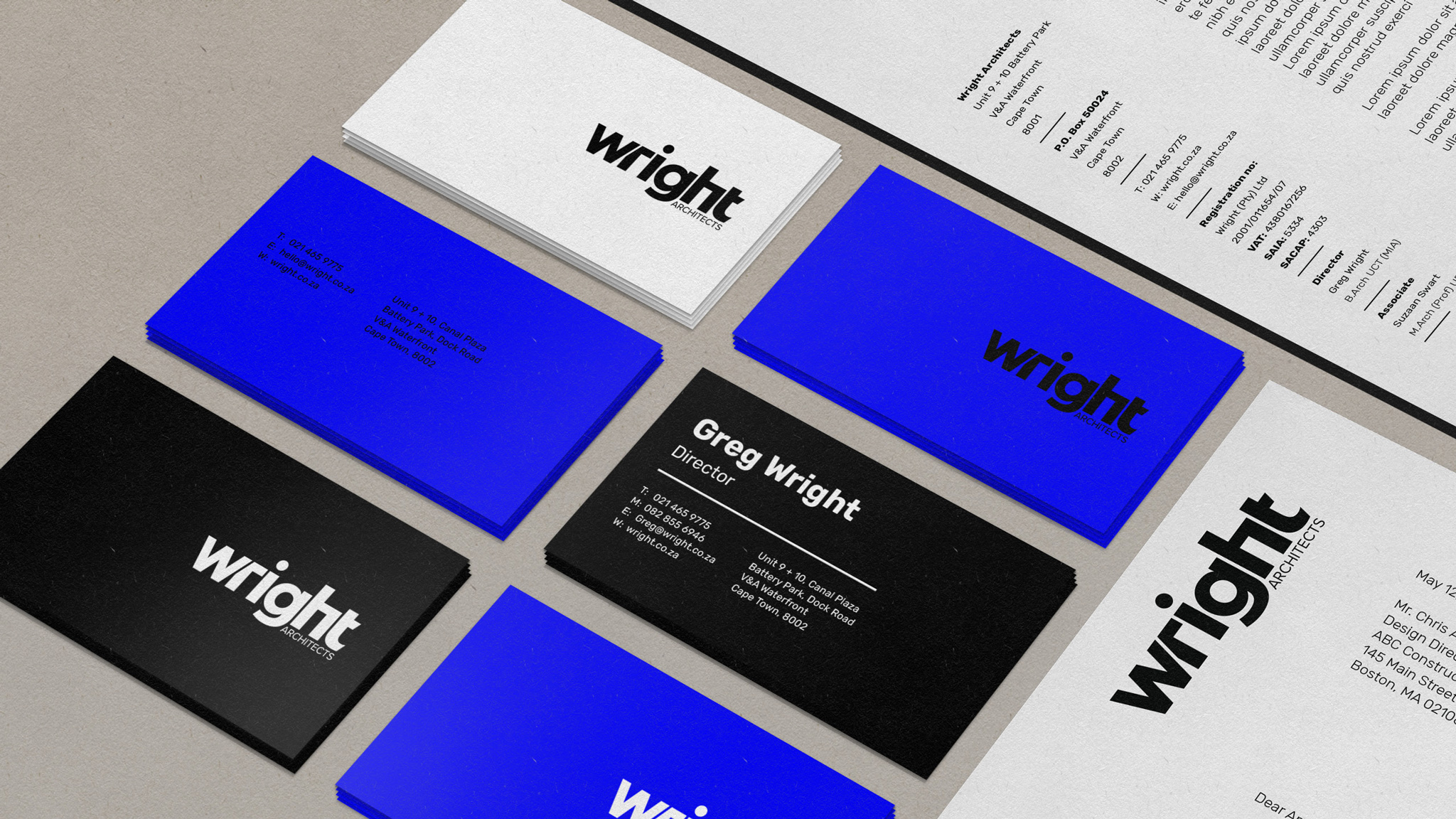
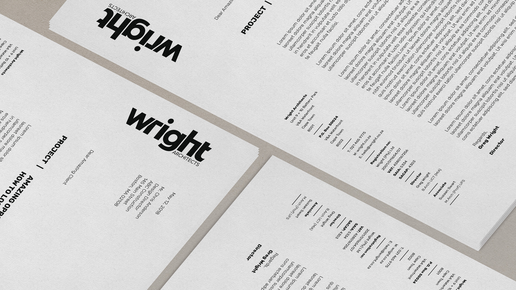
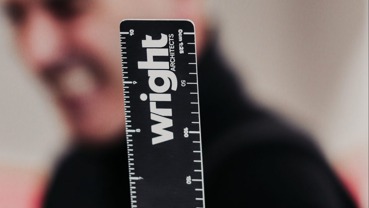
The same 17.5° geometry carries the identity across the whole practice — signage, business cards, letterhead — without a single additional flourish. A mark built on restraint, for a practice that trades on the same.
Client
Greg Wright, Director, Wright Architects