Logo · Brand Development
The Fat Badger
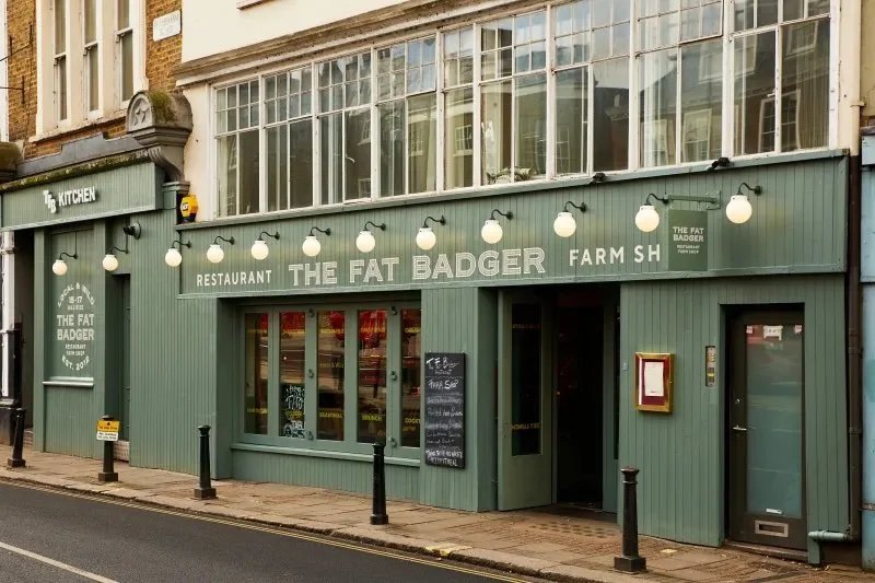
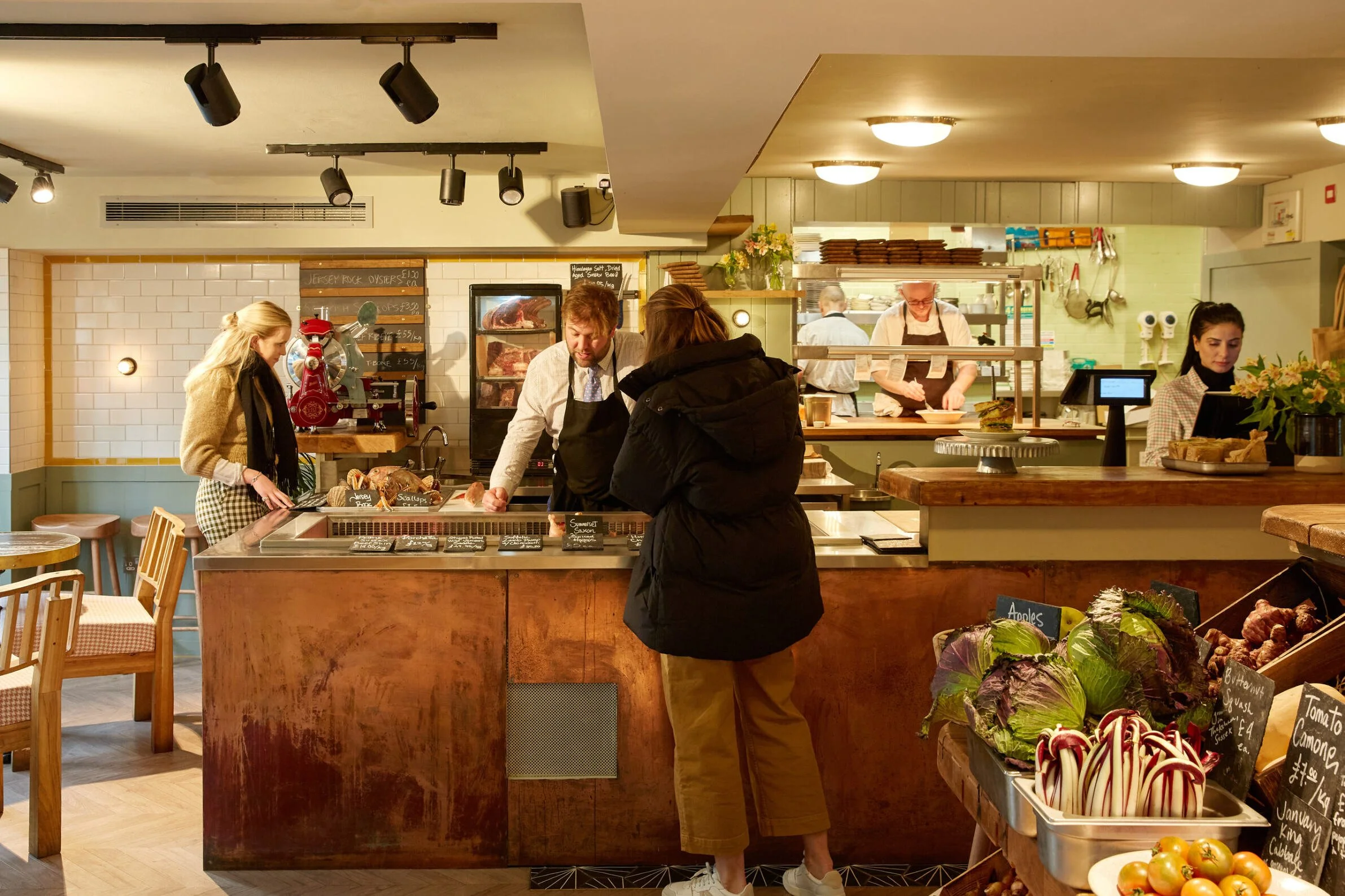
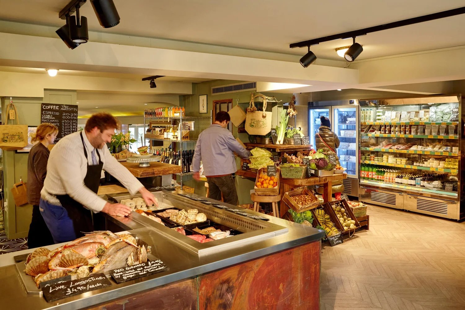
A farmer walks into a bar — a restaurant and farm shop in one, for the Gladwin Brothers' seventh London location.
The Challenge
The Gladwin Brothers wanted a visual identity that could hold two ideas at once: a fine-dining restaurant and a fresh, seasonal grocer, sharing one roof. It needed to resonate with their existing clientele while pulling in a new one entirely.
Brand Story
A Farmer Walks Into a Bar…
The Approach
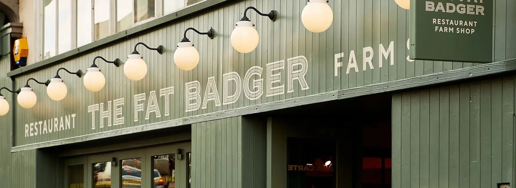
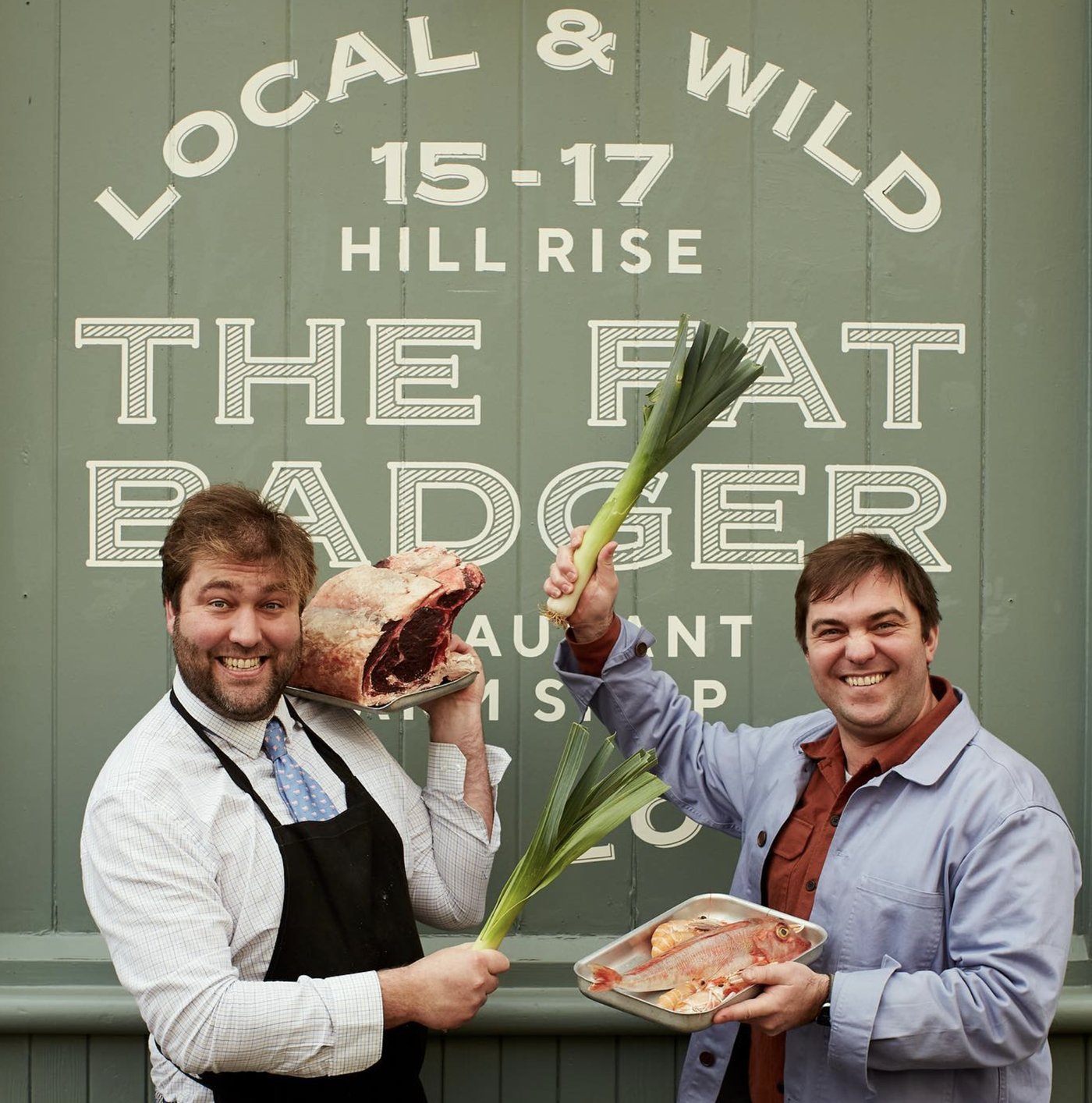
The moodboard leaned into handpainted signage — the emphasis on typography and the craft of its execution. We loved the texture of one weathered old sign in particular, the way age had worn into the letterforms, and borrowed that as inspiration for texture within our own type. The arcs in the composition, both structural and decorative, came from the same source.
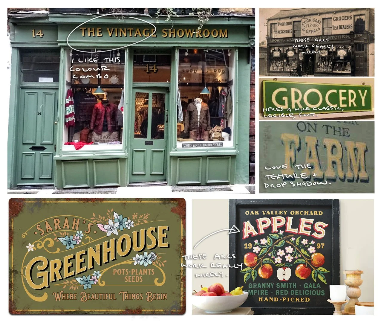
Handpainted Signage
+
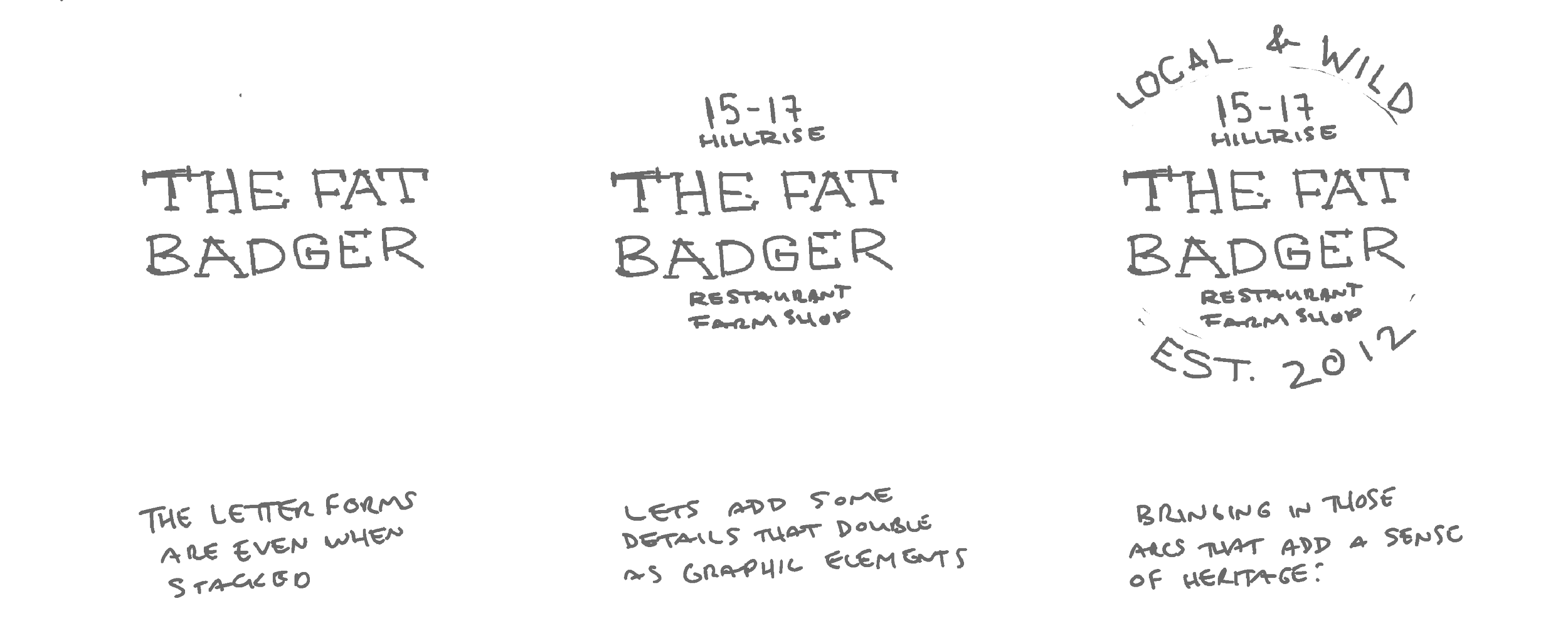
Farm-to-Fork Ethos
=
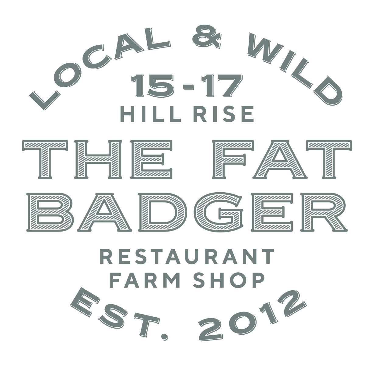
The Fat Badger
"Since launching our first restaurant, The Shed, in 2012, we've had the privilege of collaborating with Jason de Villiers. His innovative input is a game-changer for any new business."
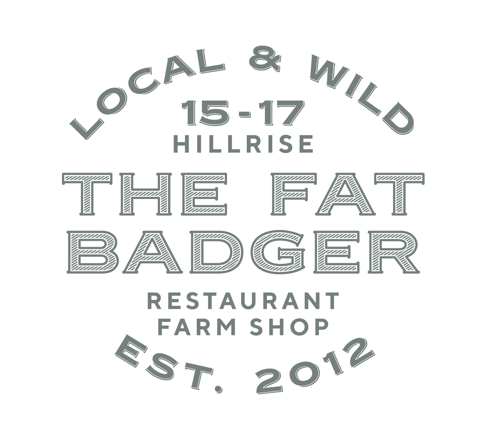
Logo Development
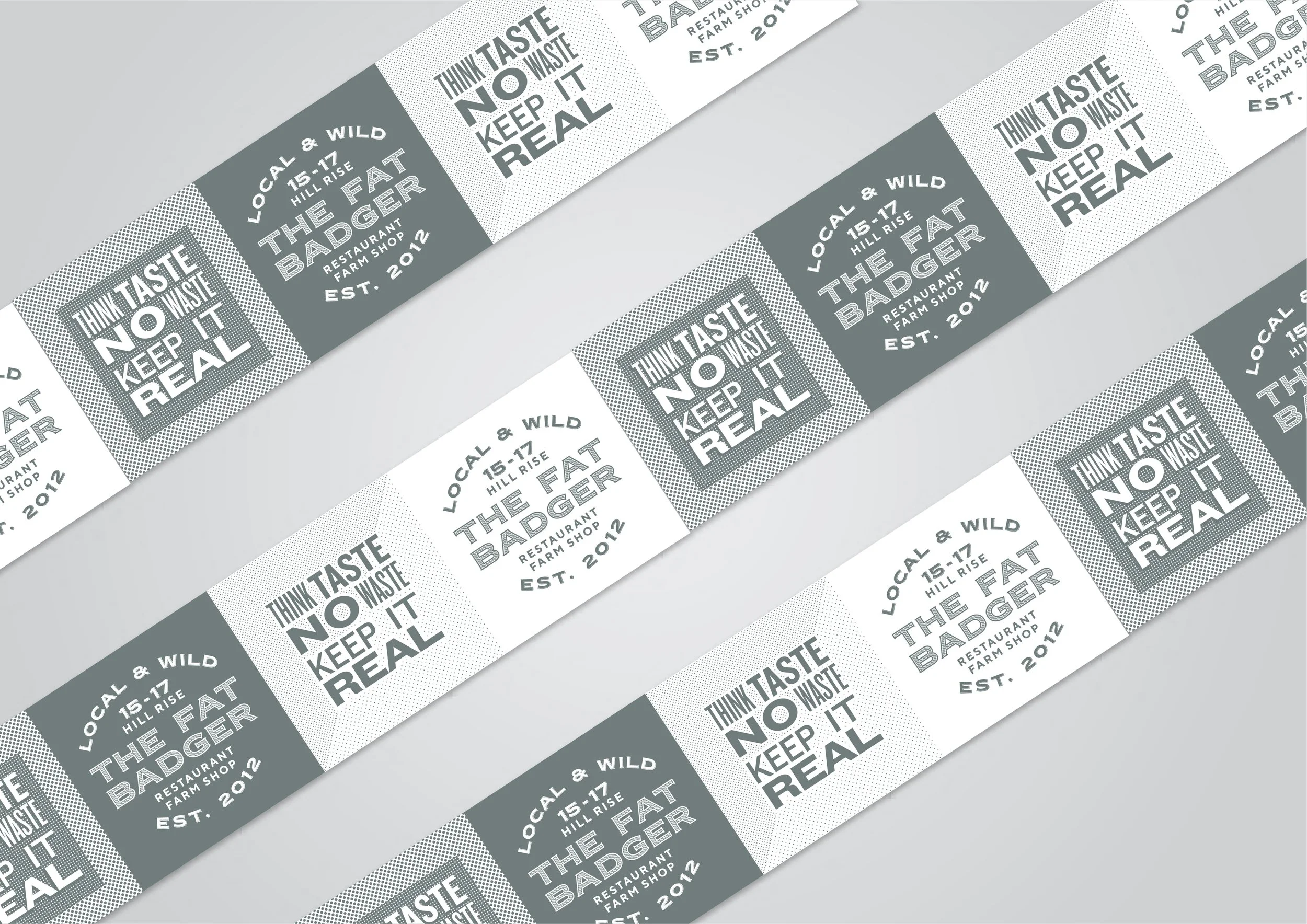
A flexible visual system for all applications — the full lockup, a solid reversal, a standalone wordmark, and the badger-head mark on its own, each one built to hold up at any size, from a farm shop sign to a jar label.


Colours
Two shades that reflect the farm-to-fork ethos while drawing from nature: Camo Green captures the earthy tones of fresh produce and the outdoors, while Lichen evokes the soft, mossy greens found growing wild.
The quick brown fox jumps over the lazy dog
AaBbCcDdEeFfGgHhIiJjKkLlMmNnOoPpQqRrSsTtUuVvWwXxYyZz 0123456789
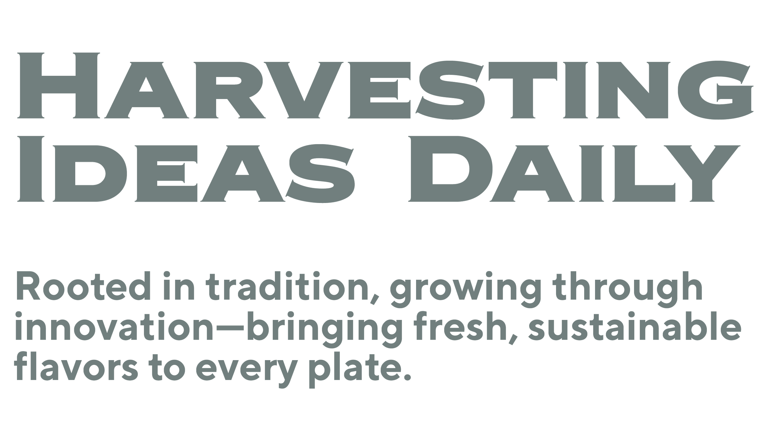
"TT Norms offers a clean, modern aesthetic for body copy; the extended letterforms and sharp serifs of Copperplate Extended bring refinement and authority to the headline. Together, a balance between heritage and modernity."
Poster & Tote Bag
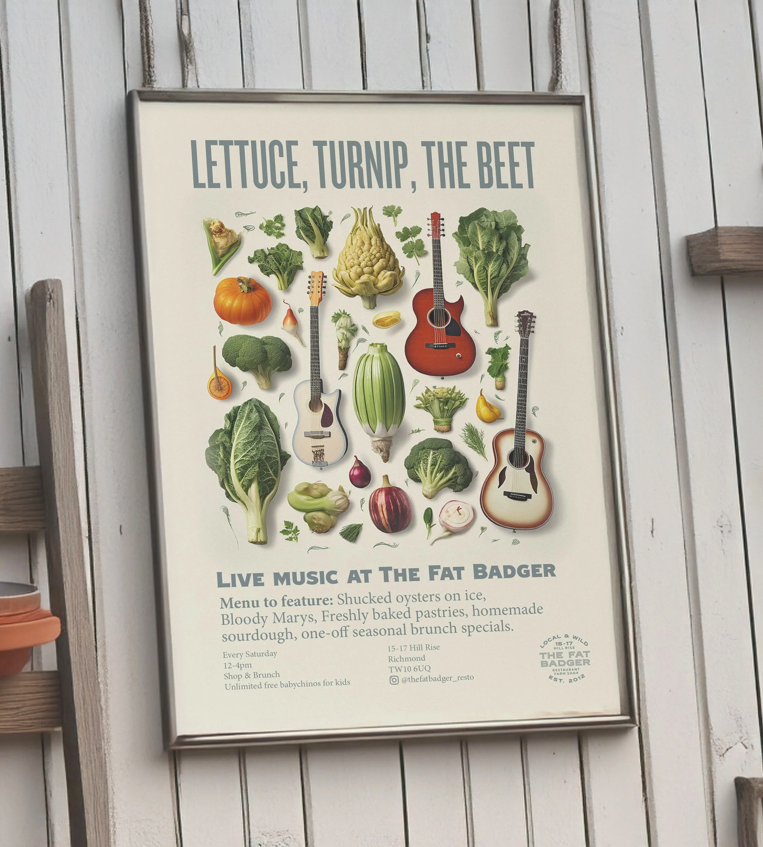
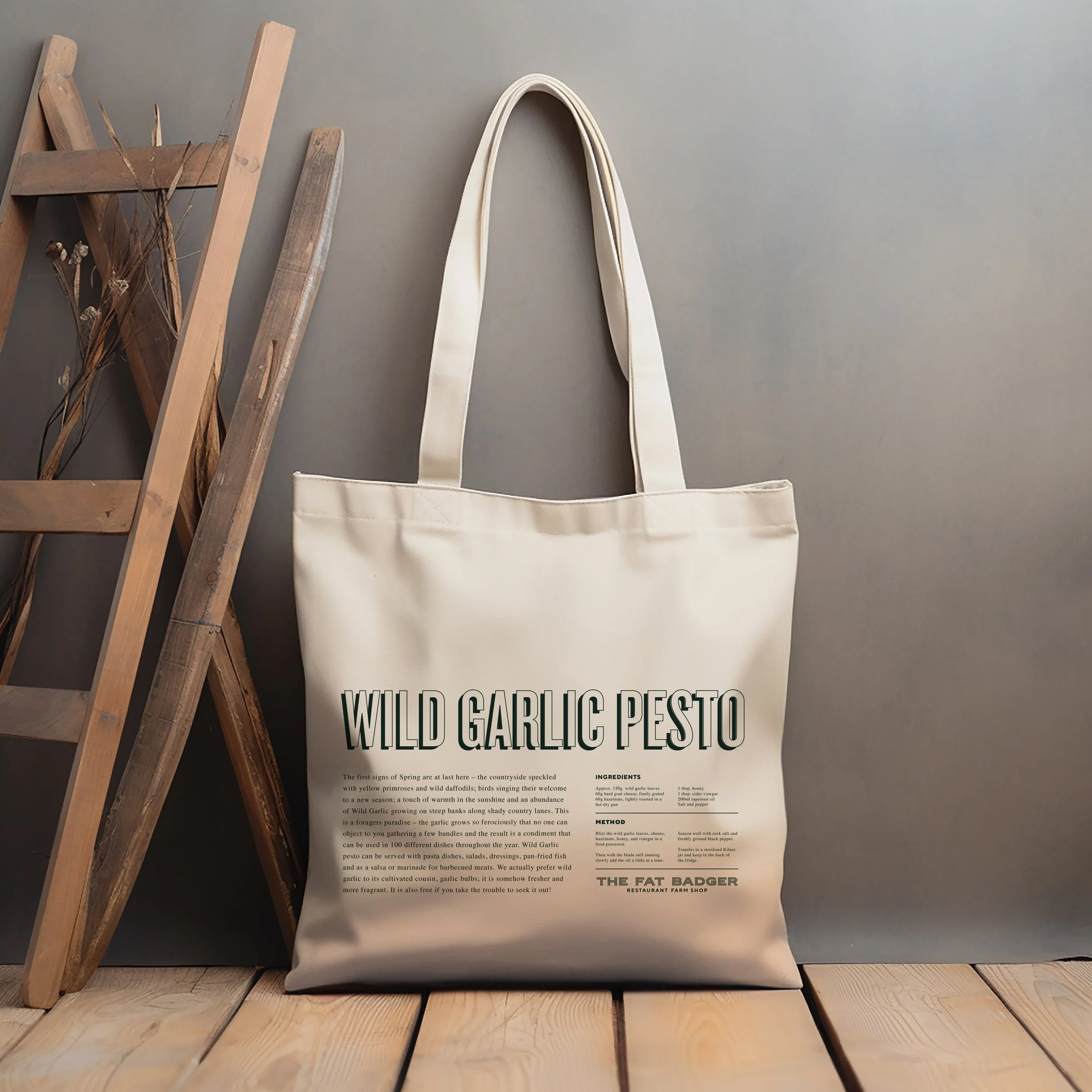
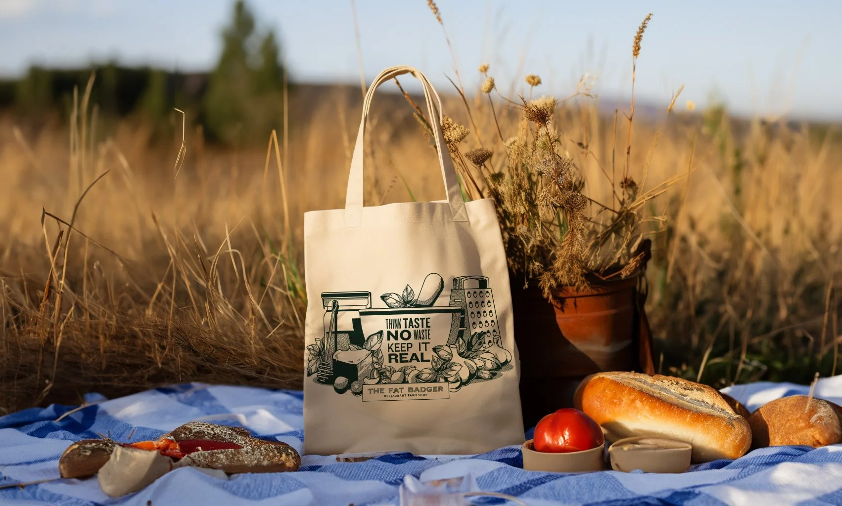
"Lettuce, Turnip the Beet" — a headline that blends fresh produce with a clever pun, echoing the restaurant's playful blend of natural ingredients and lively atmosphere. The tote bag carries the same spirit: a pesto recipe on one side, the ingredients and tools to make it on the other.
The Outcome
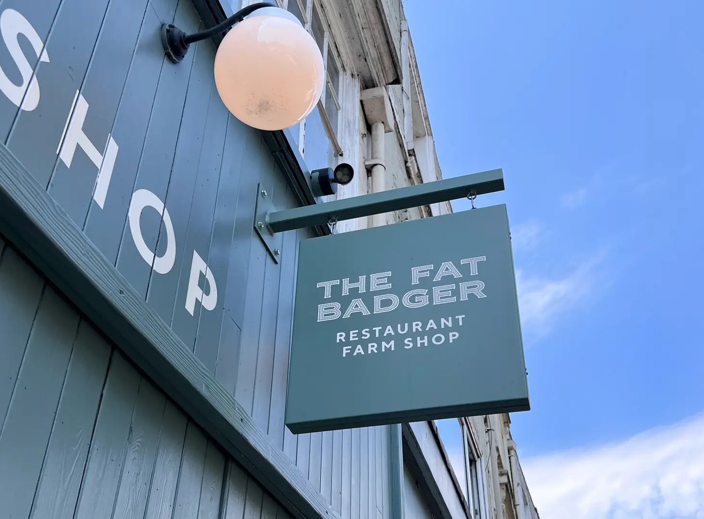
A flexible visual system now runs across signage, bags, and collateral — one identity, doing double duty as both restaurant and grocer, without ever feeling like two brands wearing one badge.
Client
Richard Gladwin, CEO, Local & Wild