Identity · Typography
Sussex
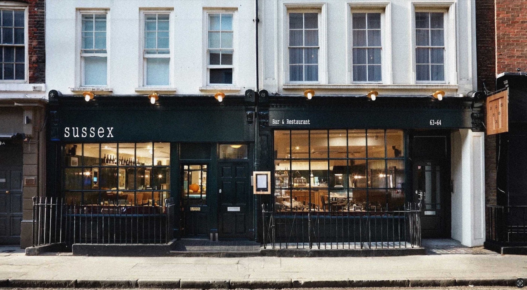
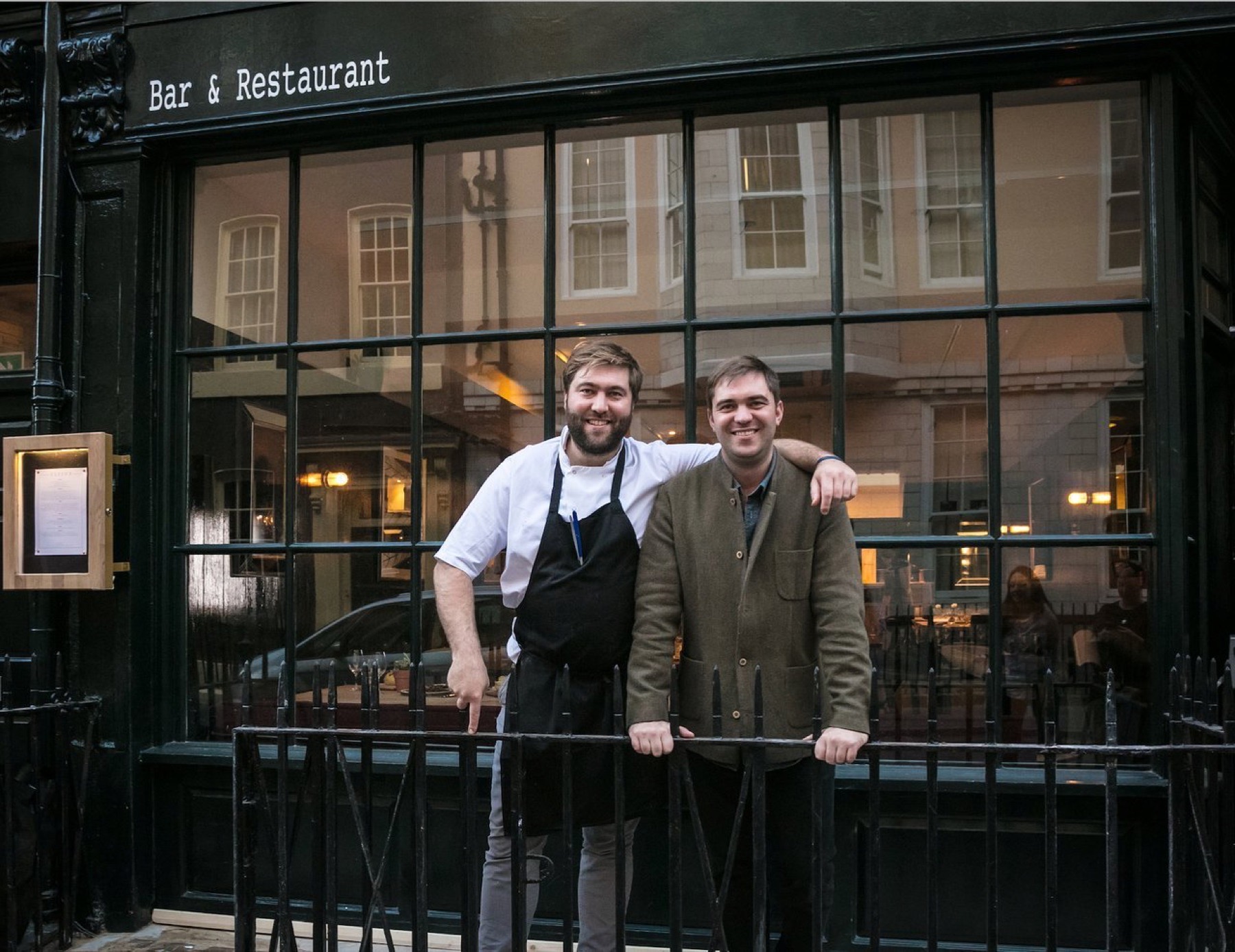
A wordmark built from a county flag, for the Gladwin Brothers' flagship wine bar and restaurant.
The Challenge
Sussex needed to feel distinct from the Gladwin Brothers' six other London restaurants — refined, intentional, and rooted in a specific place, not just another wine bar.
Brand Story
Six Birds, One Stone
The Approach
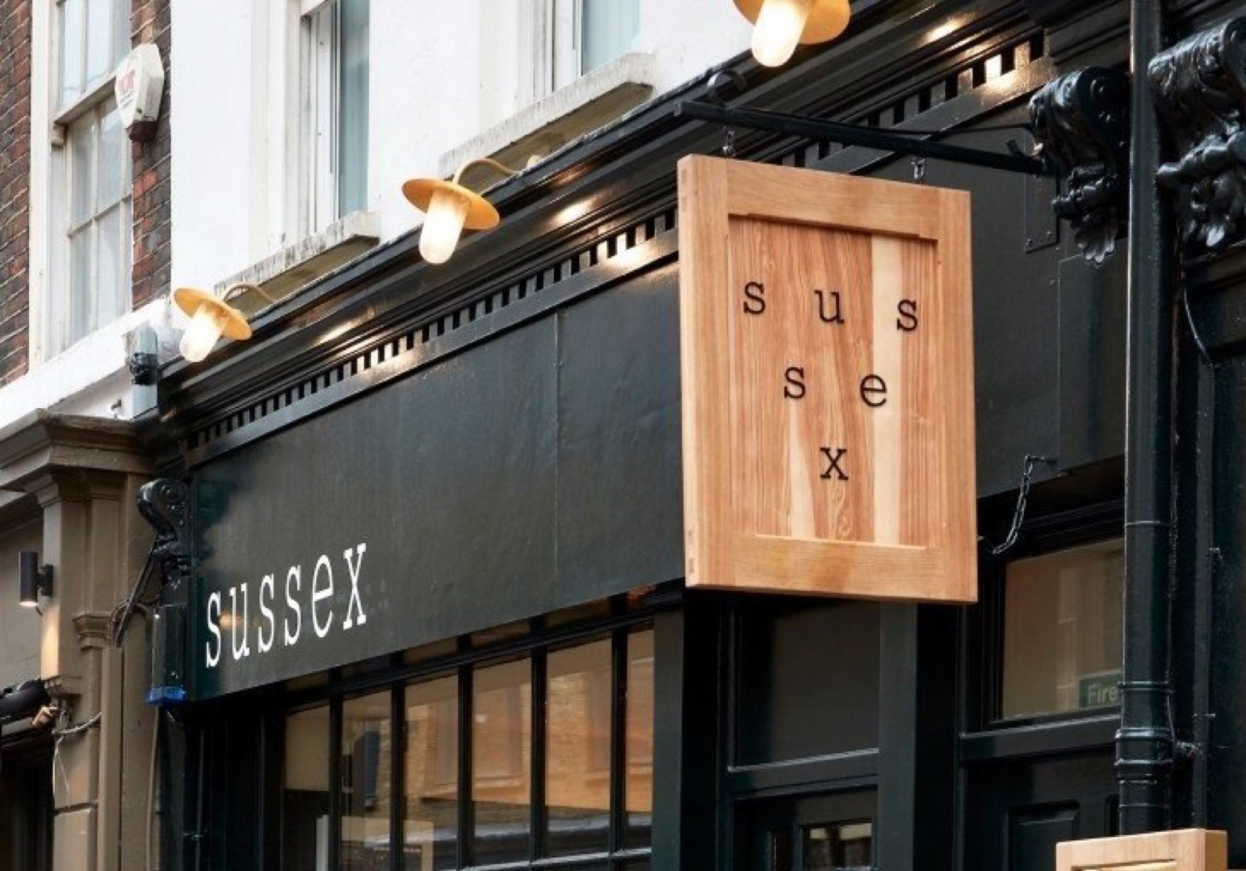
The solution came from a detail most people never notice: Sussex is the only English county whose flag carries six golden martlets in a triangular formation. Rather than design a conventional logo, we let the name itself take that shape — SUSSEX set across three lines in a triangular grid mirroring the flag, the X anchoring the composition like a keystone. The system flexes: six coffee beans for takeaway, six wine droplets for the wine list, six wildflowers for seasonal menus — same rhythm, shifting tone.
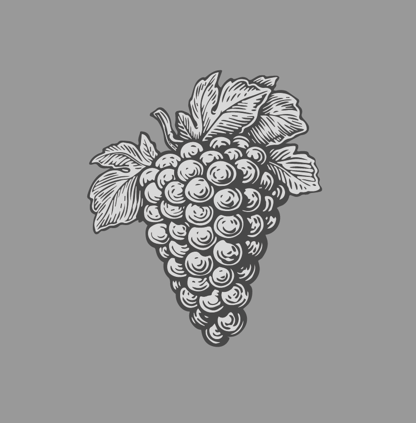
Wine Grapes
+
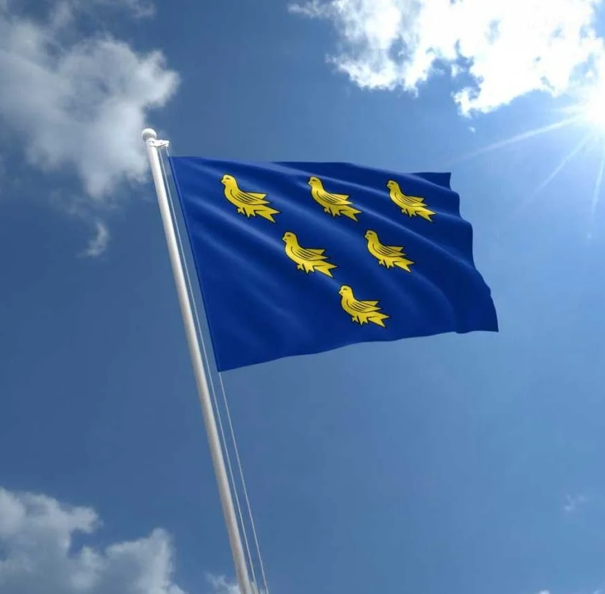
The Sussex Flag
+
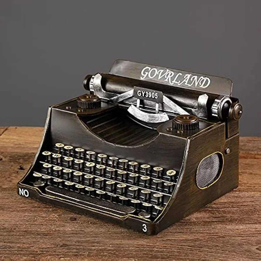
Typewriter Type
=

The Wordmark
The System, Flexing
The same grid flexes across contexts: six martlets for the core mark, six coffee beans for takeaway, six wine droplets for the wine list, six wildflowers for seasonal menus. Same rhythm, shifting tone.

"Now, with six thriving restaurants across London, Jason's unparalleled creativity and vision have been essential at every turn."
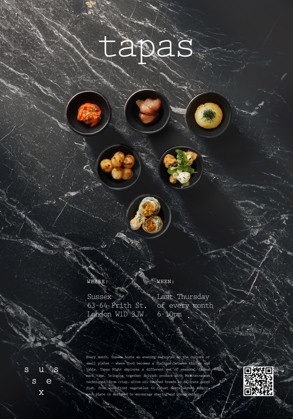
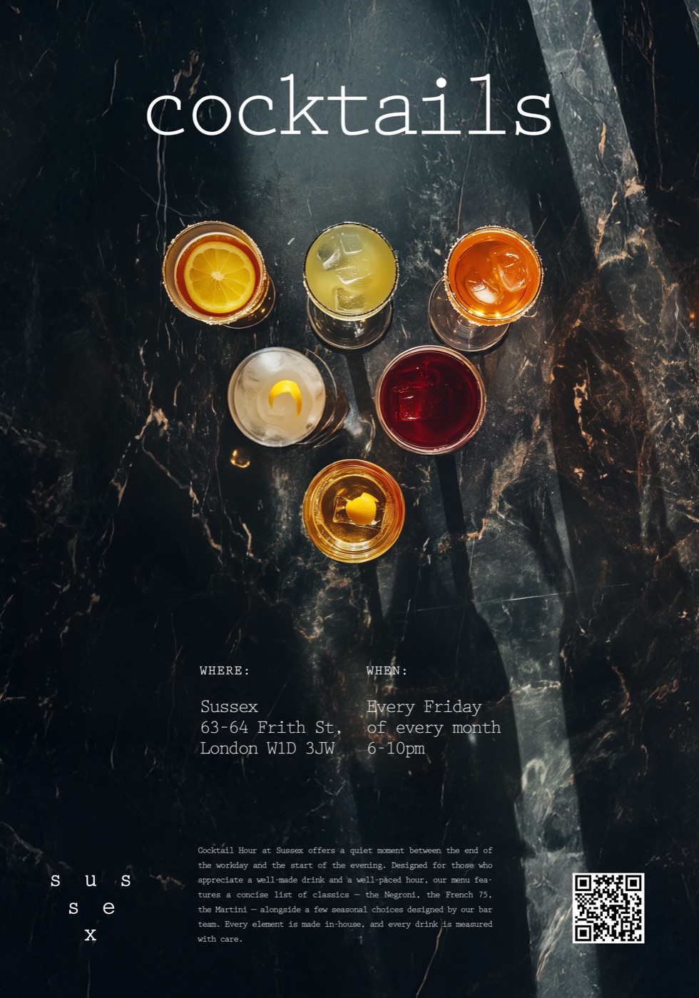
Posters
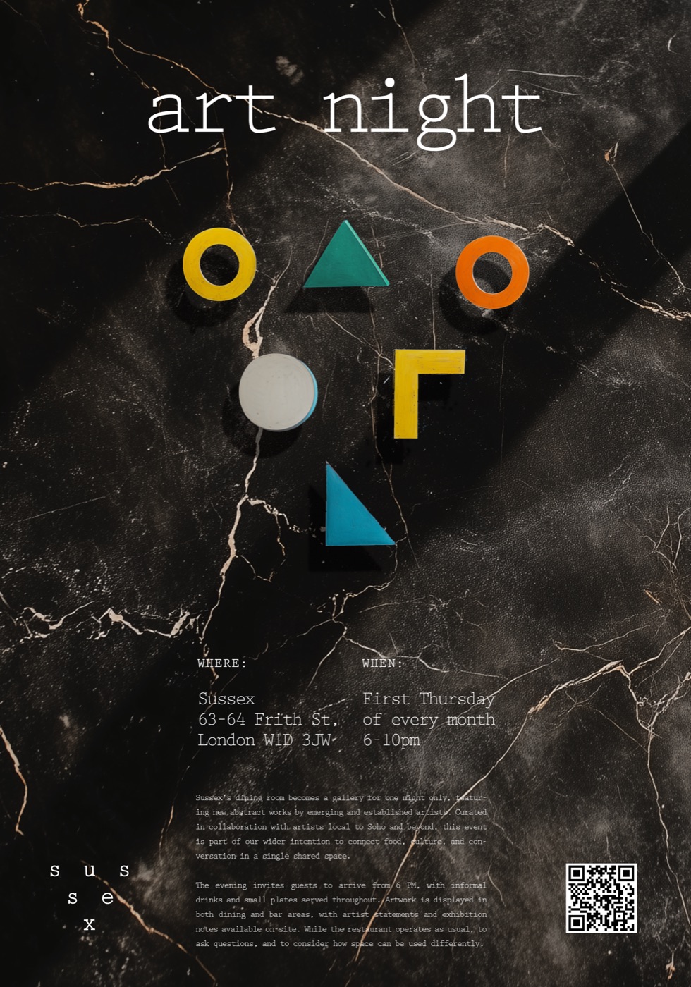
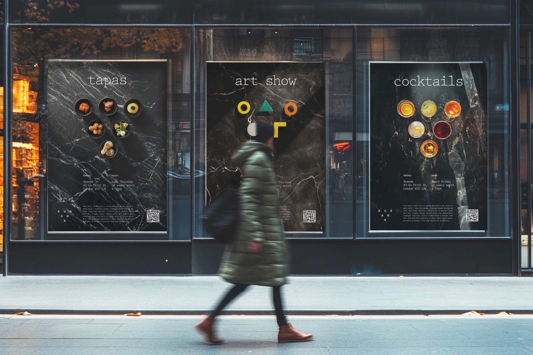
Each event poster subtly references the six martlets of the Sussex flag through a triangular arrangement — six small plates for Tapas Night, six glass silhouettes for Cocktail Hour, six abstract forms for the gallery event. Quiet continuity across the campaign, with room to vary.
Colours
A palette built around the region itself — the deep tonal qualities of the South Downs, balanced against an unexpected breath of spring.
The quick brown fox jumps over the lazy dog
AaBbCcDdEeFfGgHhIiJjKkLlMmNnOoPpQqRrSsTtUuVvWwXxYyZz 0123456789
"A monospaced typewriter font designed by Howard Kettler in 1953 — its evenly spaced, mechanical rhythm adds structure and a sense of deliberation, a nod to literary tradition and a reminder of craft."
The Menu
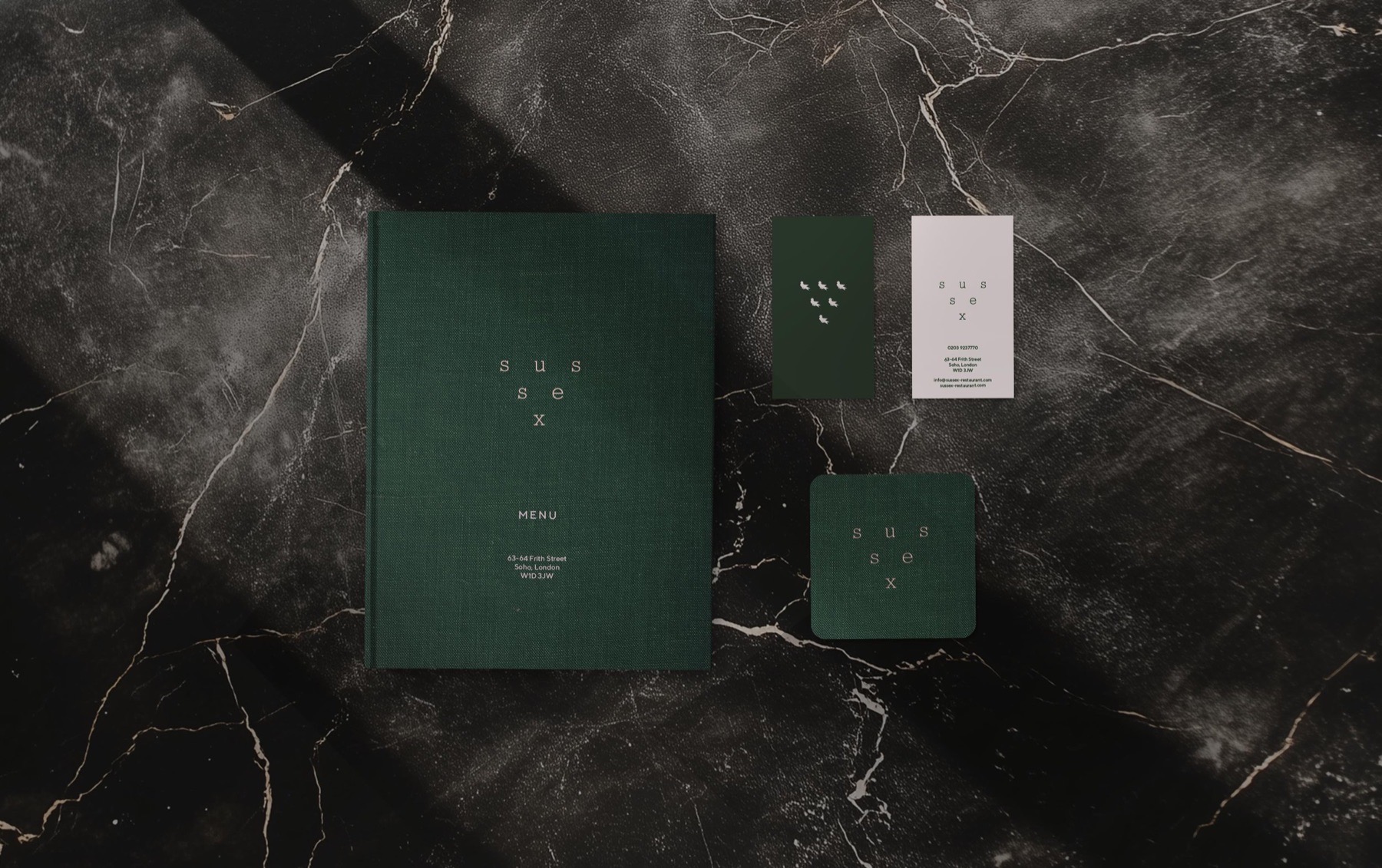
Presented like a clothbound book — a small gesture that hints at story, permanence, and care. Inside, minimal and deliberate, letting the food take the lead. Business cards and coasters follow the same restrained language.
The Outcome
The triangular system now runs across menus, signage, business cards, and event posters — a mark that rewards curiosity, instantly legible to locals and layered with meaning for everyone else.
Client
Richard Gladwin, CEO, Local & Wild