Rebrand · Illustration · Website
Hally's
A neighbourhood café in Parsons Green, reimagined around a single idea: a tangle of moments.
The Challenge
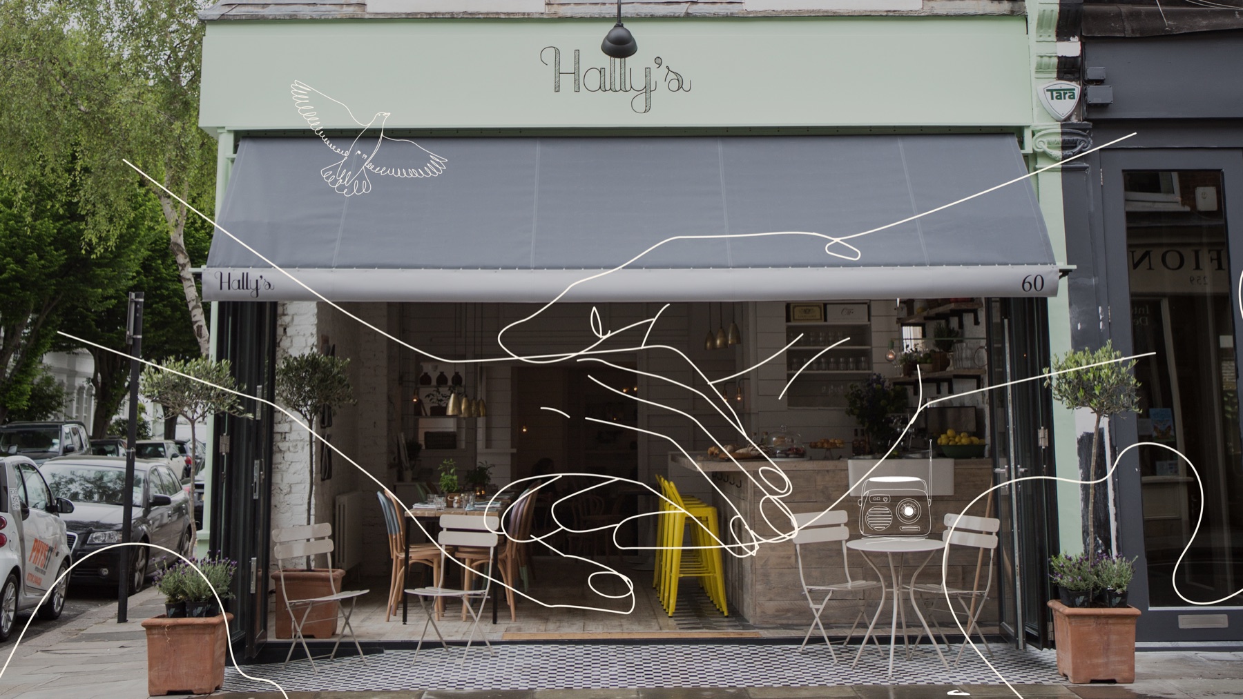
Hally's has been serving its Parsons Green neighbourhood for over a decade — a cosy, welcoming café that had never quite had branding to match. Anna, the owner, wanted a fresh, elegant identity that still felt like the place regulars already loved: engaging, energetic, unmistakably itself.
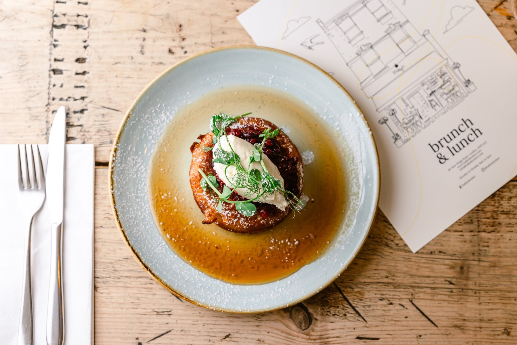
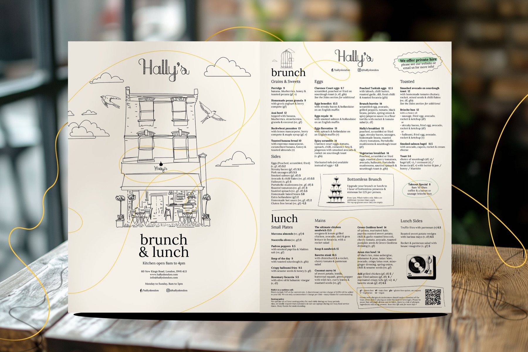

Brand Story
A Tangle of Moments
The Approach
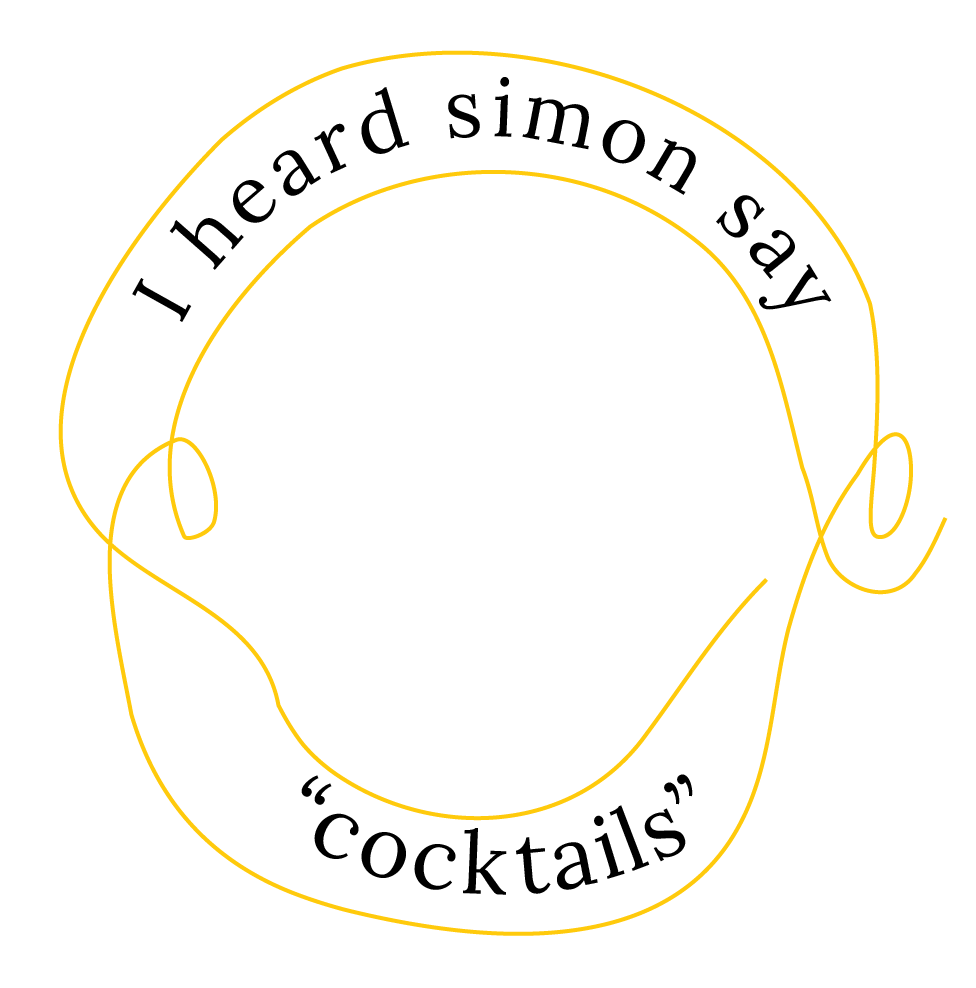
The idea we landed on was a tangle of moments — every café is a quiet stage where lives briefly cross: friends meet, strangers exchange a glance, a neighbour pauses for a break, then moves on. We built a visual system around that convergence: a single wandering line, drawn loose and looping like light painting, threading through the illustrations, packaging, menus, and site. Lora, a modern serif with roots in calligraphy, gave the looseness of the hand-drawn line something to push against — refinement meeting casualness.
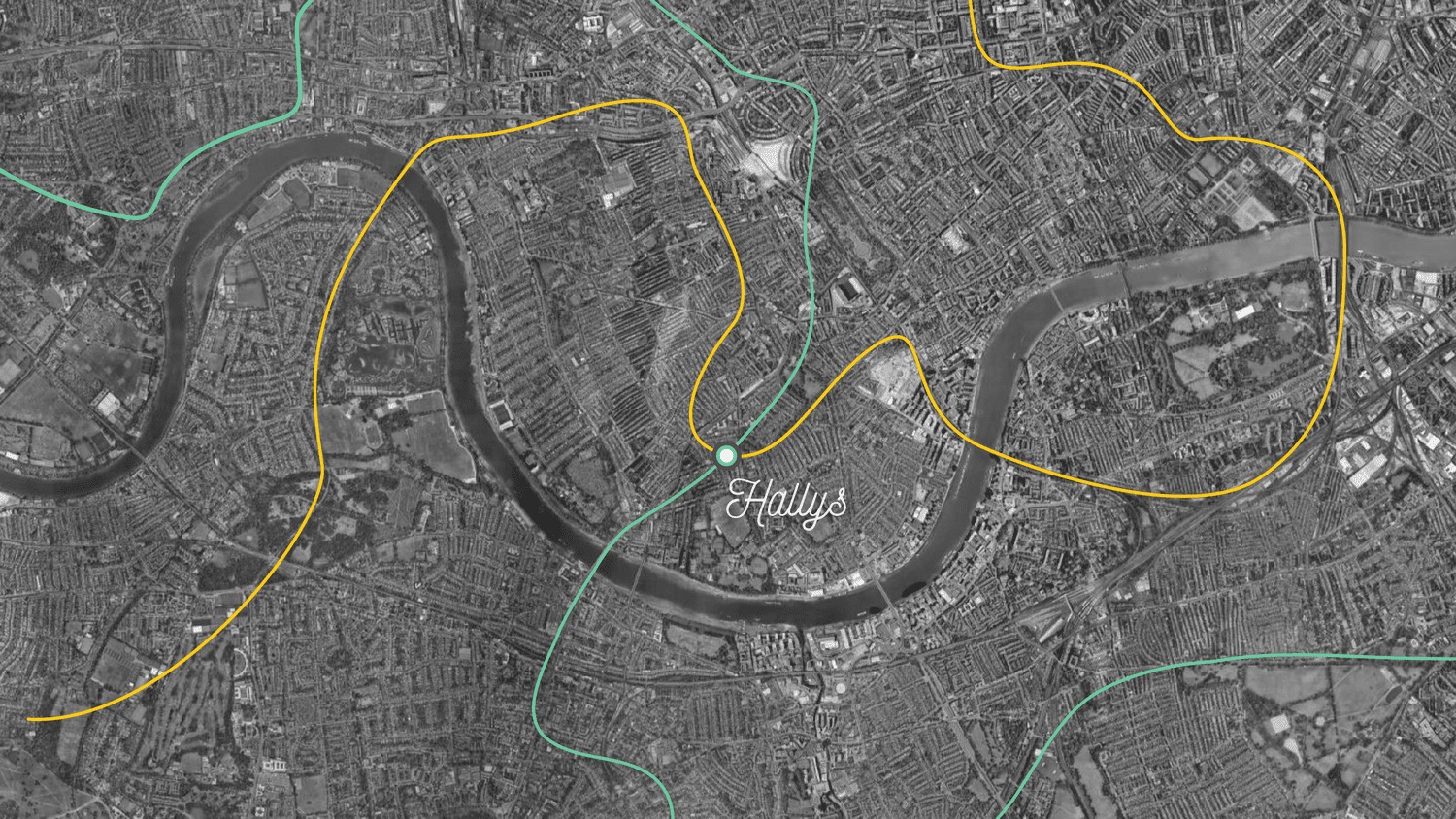
Wandering Paths
+

Light Painting
=
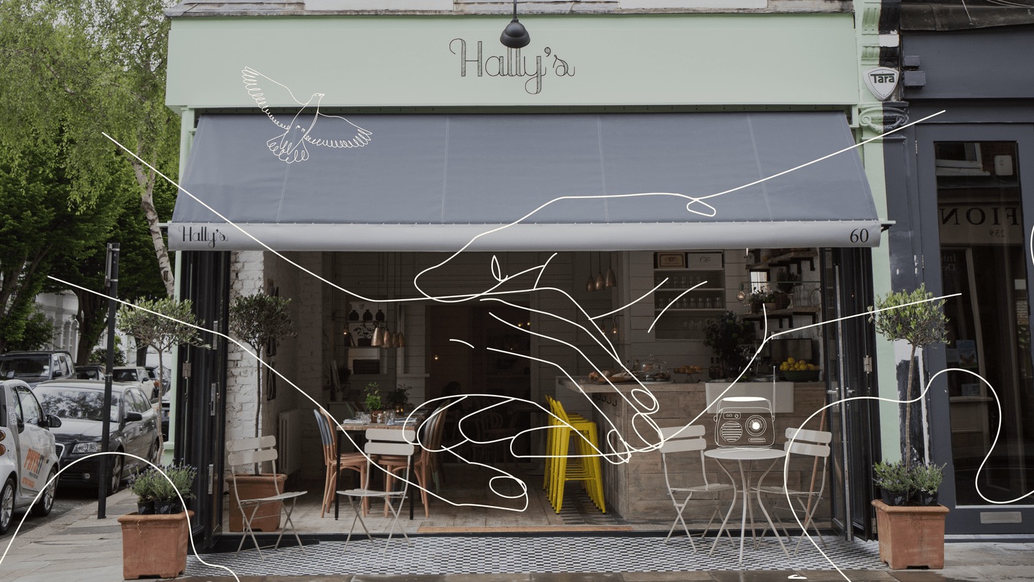
A Tangle of Moments
"He landed on a visual concept that's bold, tasteful and totally original — it helped us stand out while still feeling completely like us."
The Illustrations
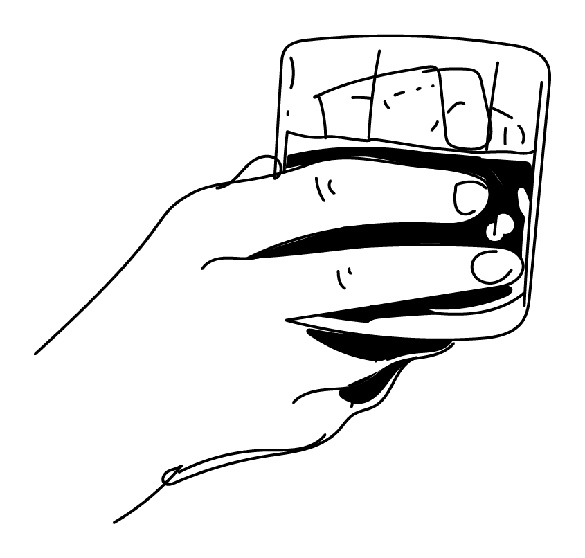
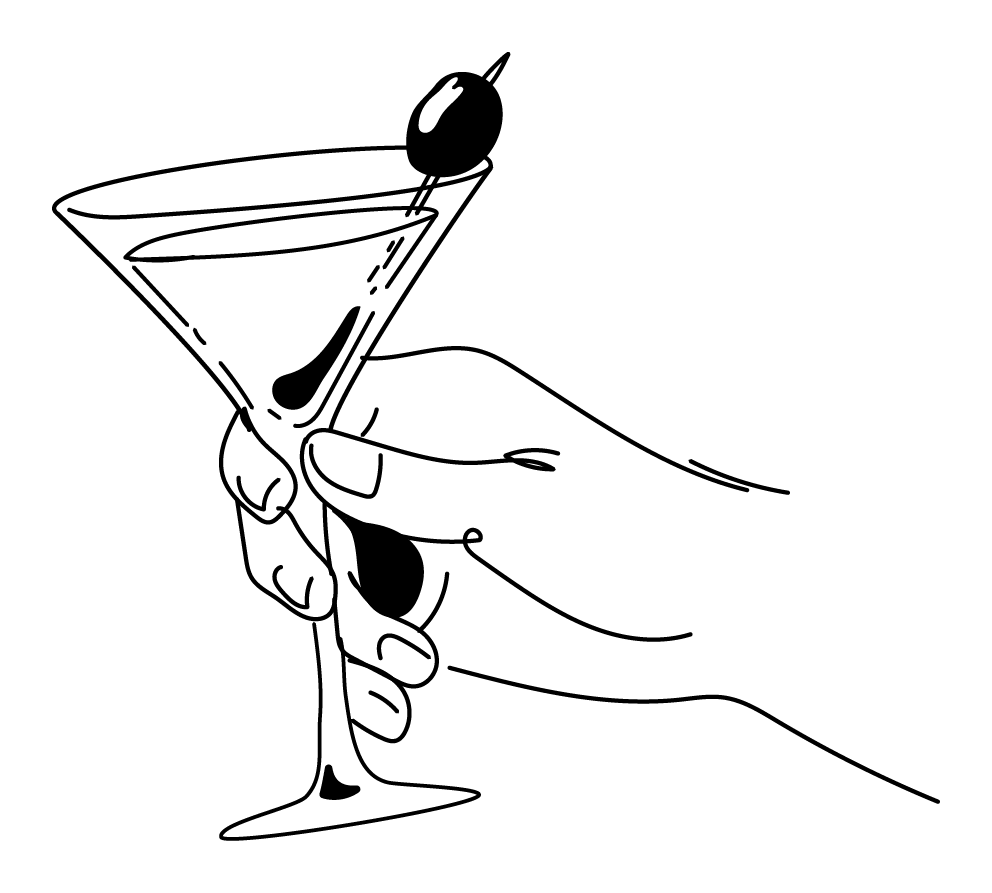
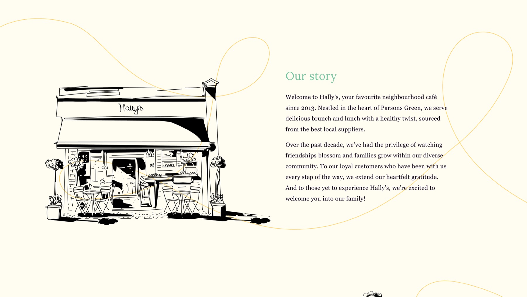
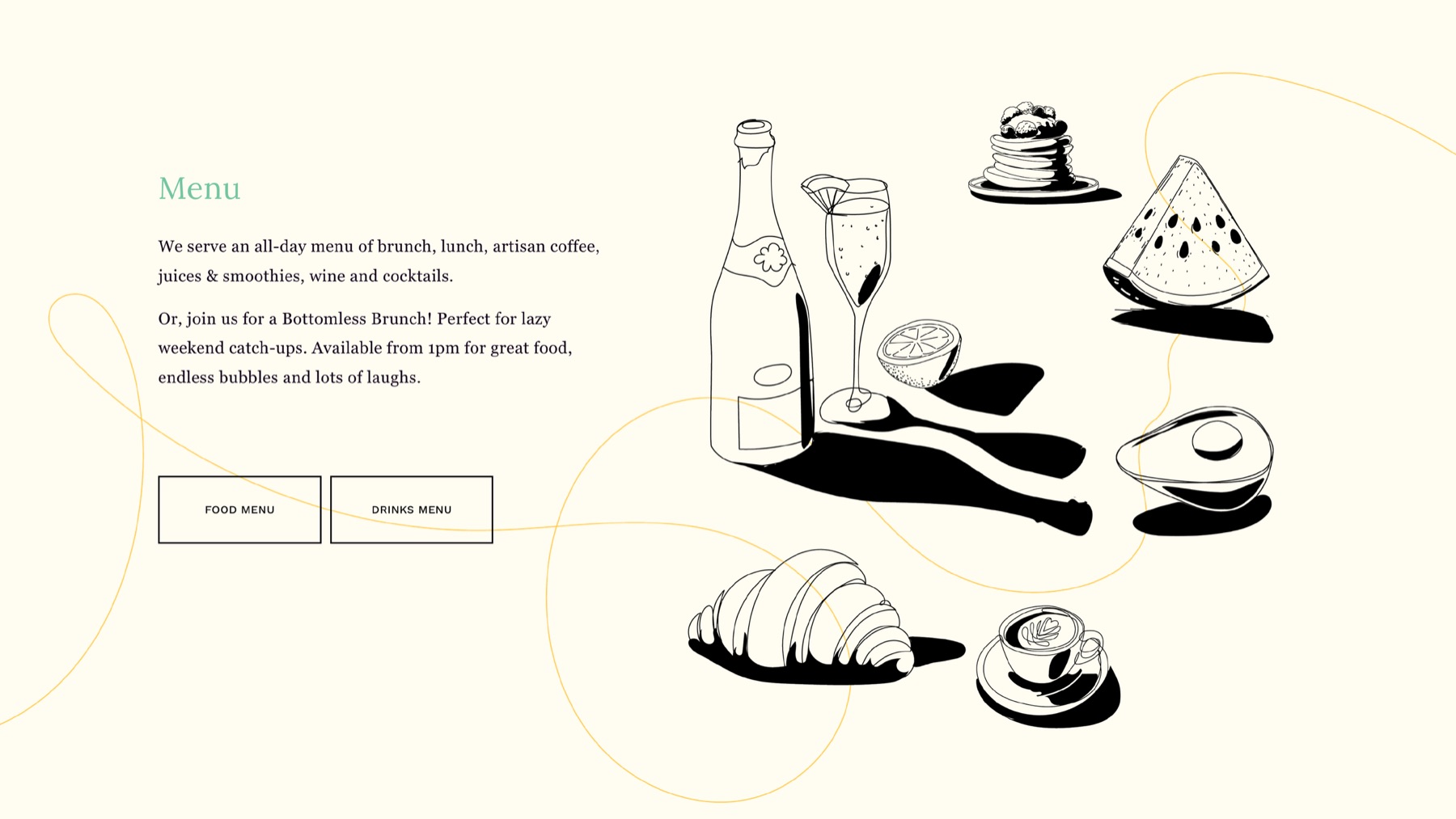
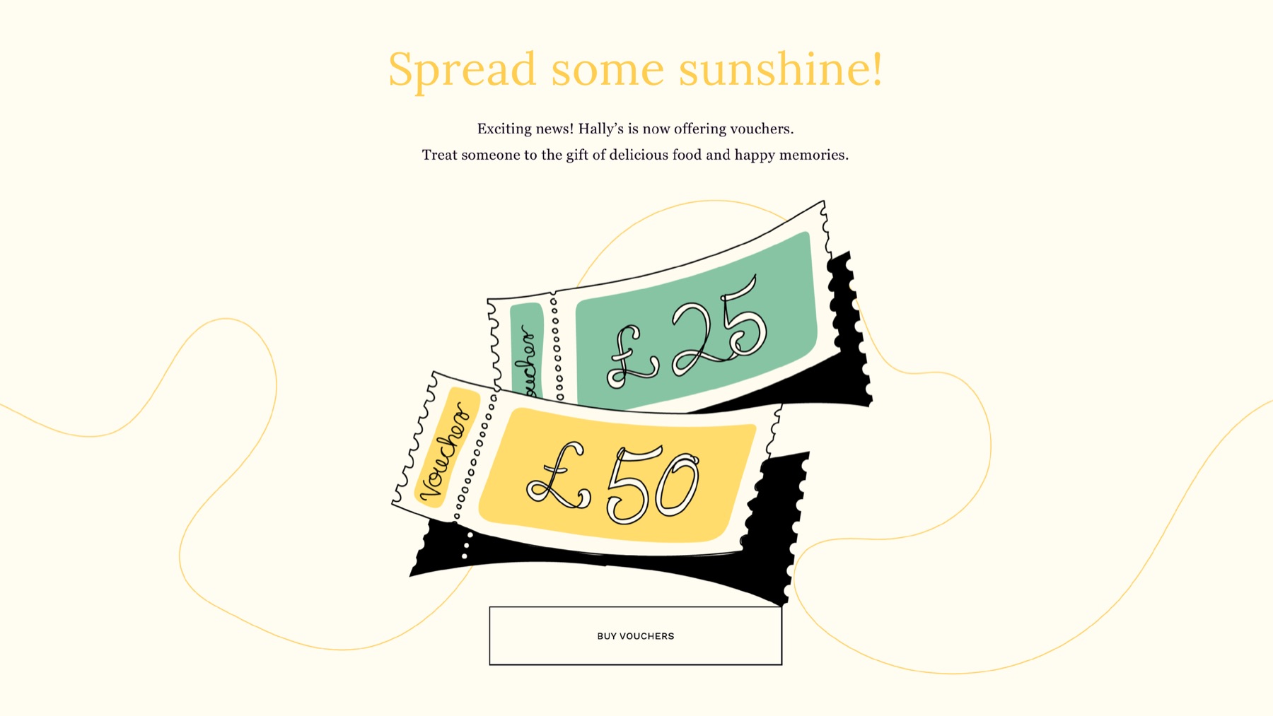
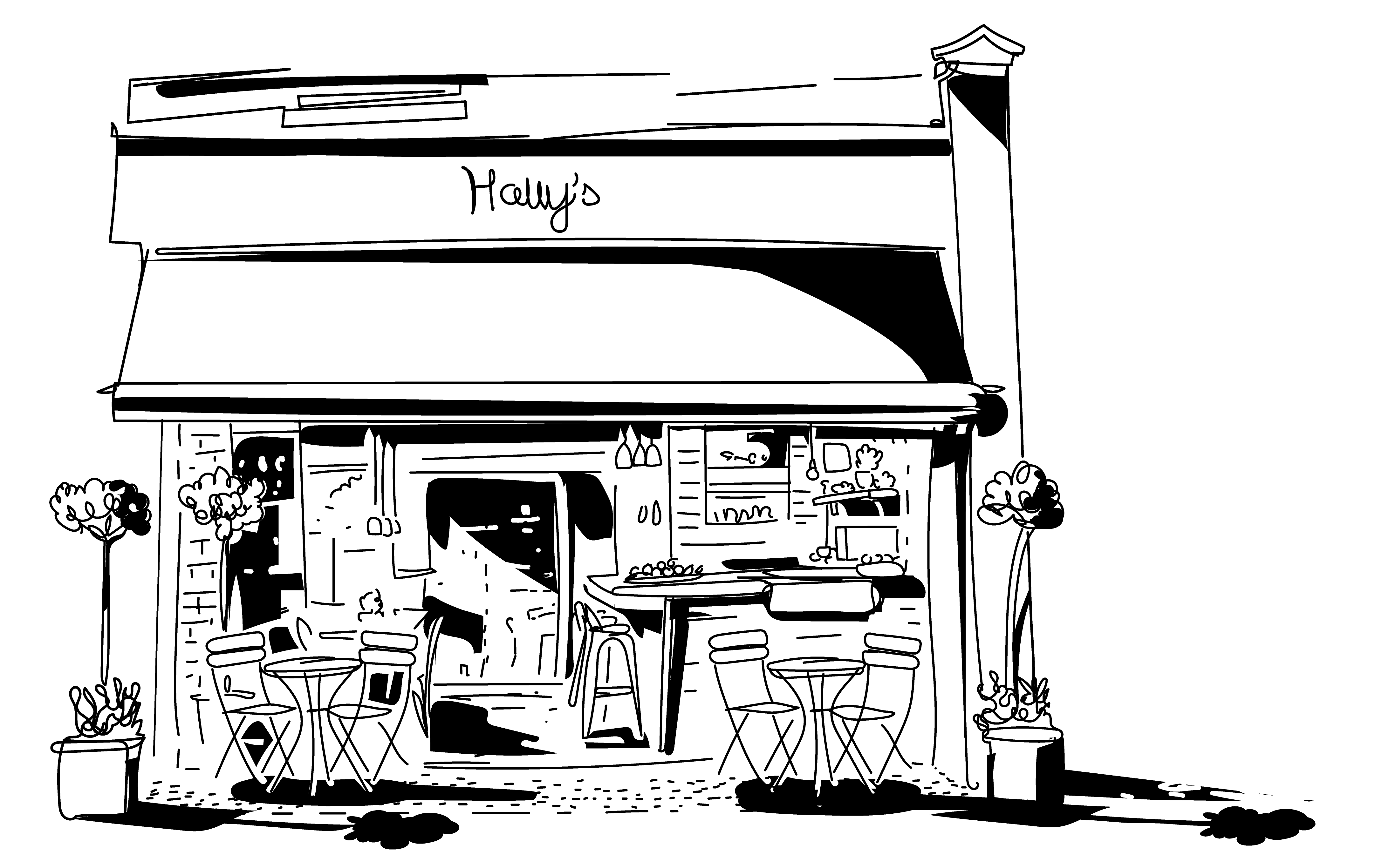
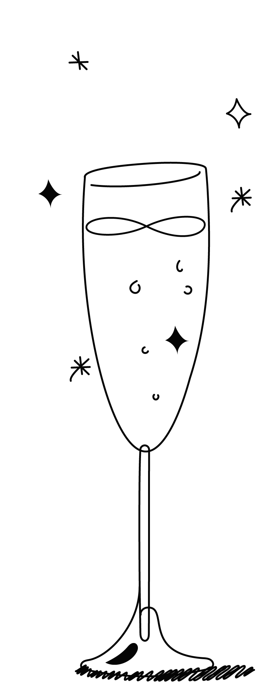
A hand-drawn set built alongside the wandering line — cocktails, glassware, and small in-jokes that show up across the menu, packaging, and site.















Colours
A palette built to feel as vibrant and easygoing as the café itself — from the soft warmth of Flat White to the grounding calm of Charcoal.
The quick brown fox jumps over the lazy dog
AaBbCcDdEeFfGgHhIiJjKkLlMmNnOoPpQqRrSsTtUuVvWwXxYyZz 0123456789
"Lora offers a grounded counterbalance — a modern serif with roots in calligraphy, combining classic elegance with a contemporary rhythm."
The Outcome
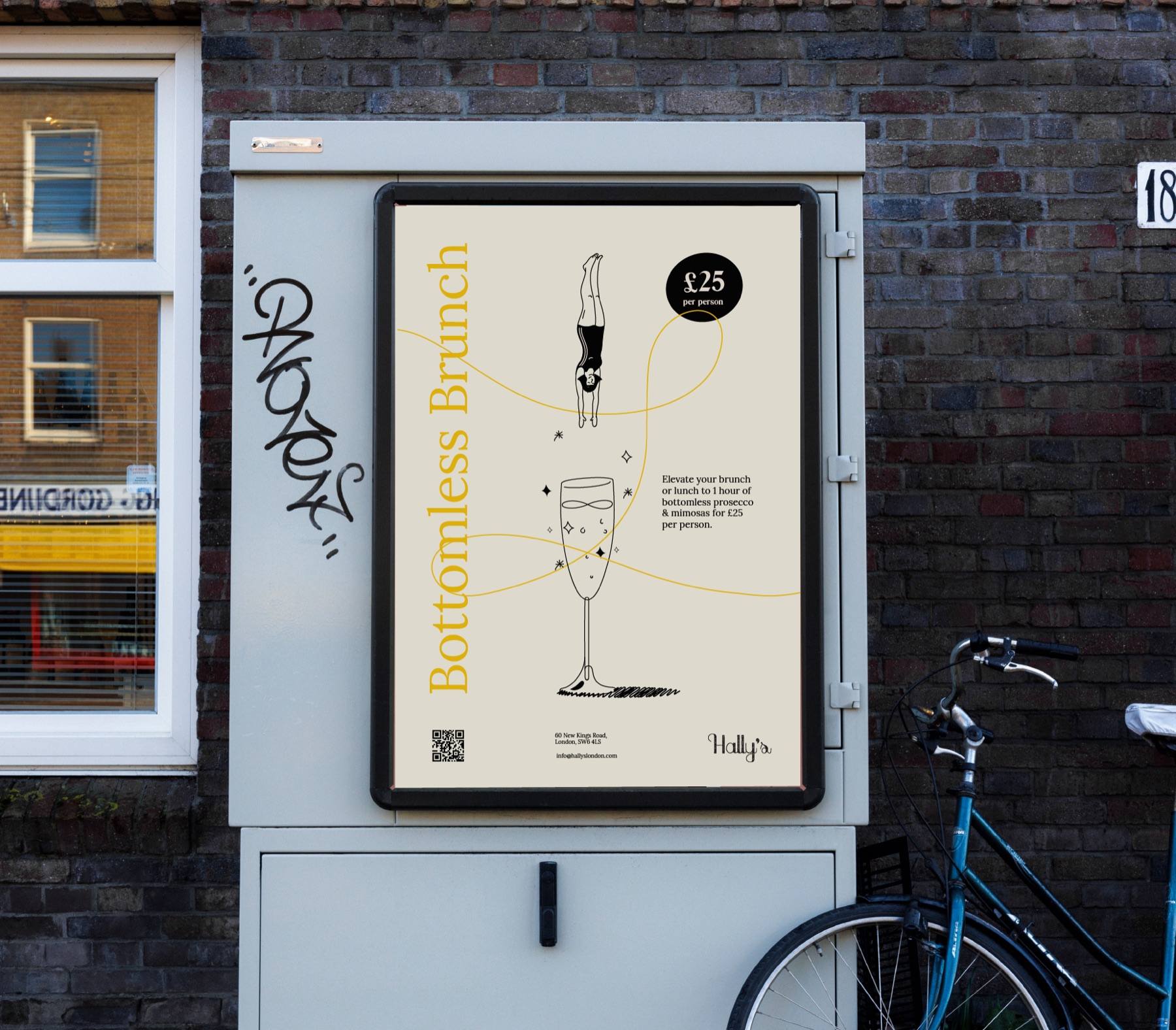
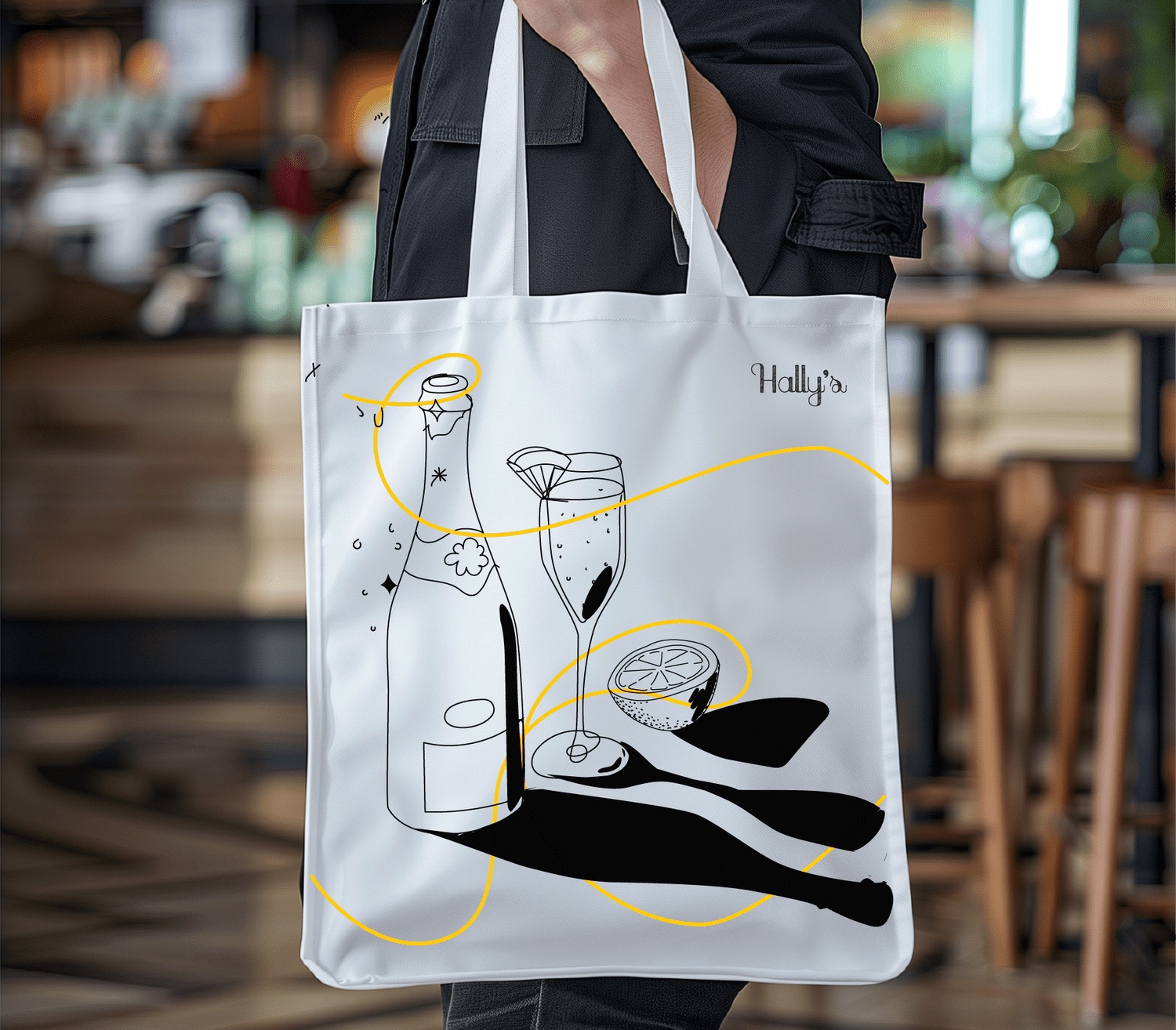
The new identity now carries Hally's across every touchpoint — website, menus, tote bags, packaging, seasonal posters — all speaking the same wandering-line language. A decade into the relationship, it's a brand that finally looks and feels like the café people already loved.
Client
Anna Halliday, Founder, Hally's