Logo Design
Selected Brandmarks
Behind every simple logo is a not-so-simple idea. A look behind the curtain at how these marks came to life.
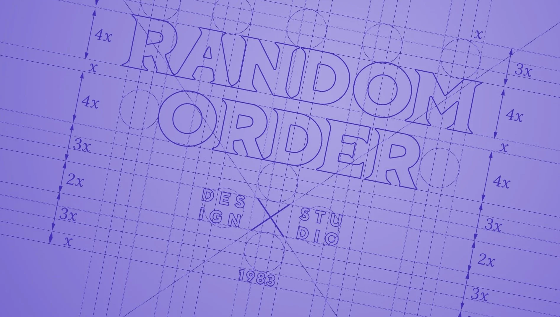
About the Process
The marks here are rooted in strategy, story, and reduction — a balance between clarity and meaning. Each logo begins as a thought experiment: how do you express the soul of a brand using as little as possible? The answer often lives in dualities — function and feeling, concept and form.
Brand Story
Start With Meaning
The Backstory
Every logo starts with listening — getting close to a brand's personality, its ambitions, the people behind it. From there it's distillation: references, sketches, metaphors, patterns that feel both familiar and surprising. More often than not, the solution arrives when two distinct ideas lock together. That's where the spark is. That's where the logo begins.
Tortuga Loca — Mexican Radiance
For this bold, vibrant Mexican kitchen, the logo brings together symbolism from faith and folklore. A sharp monogram "T" radiates outward from a hexagonal frame — the hexagon a nod to a tortoise-shell plate, the radiant lines borrowed from the iconography of Our Lady of Guadalupe. Grounded and glowing, at once.
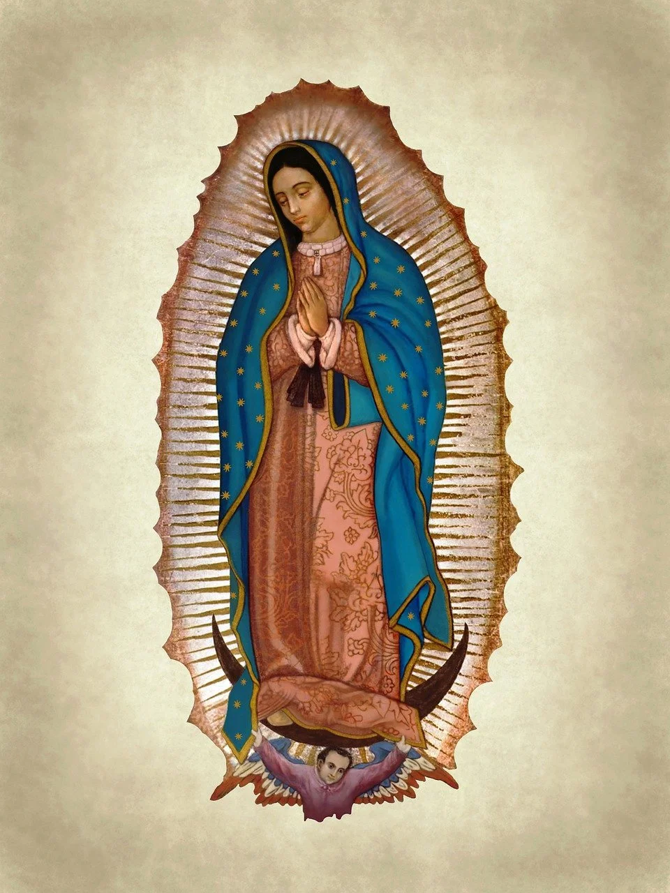
Our Lady of Guadalupe
+
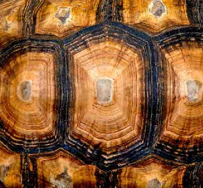
Tortoise Shell
=

Tortuga Loca
Wilma — Caring First
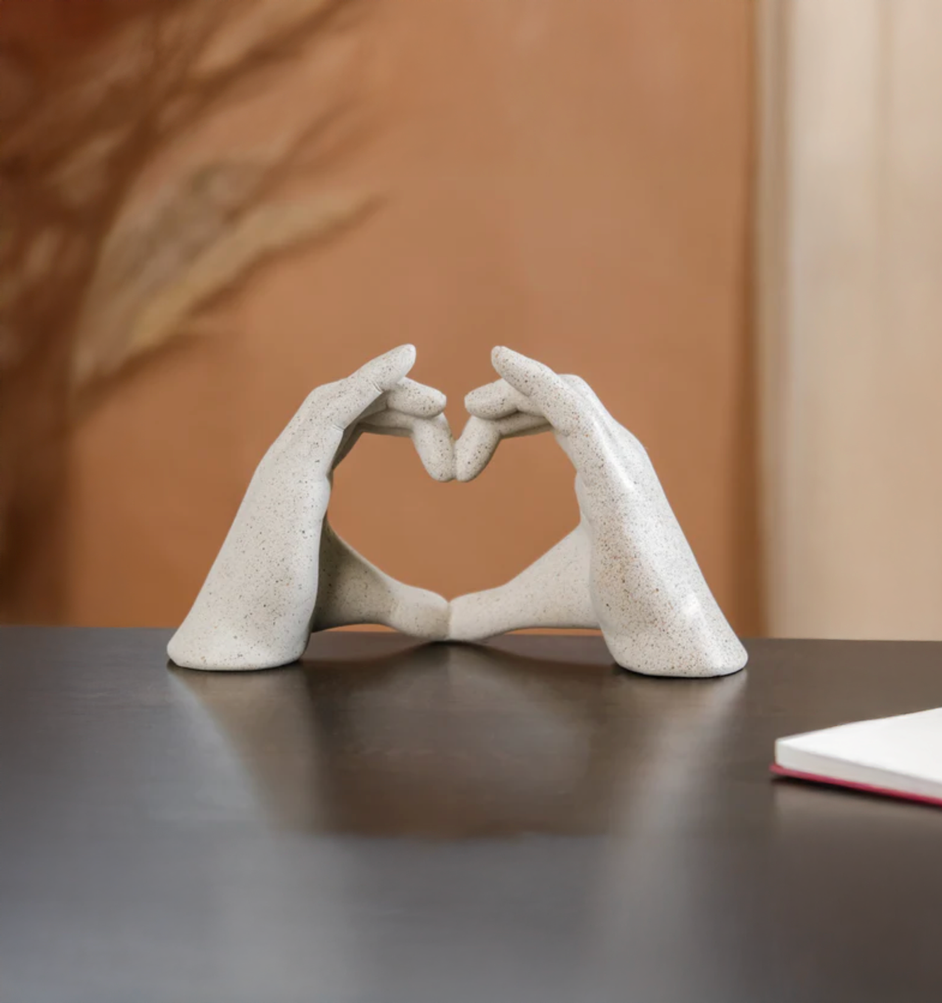
Wilma supports people through the challenging days after losing a loved one, making estate transfers clearer and easier. Rounded letterforms and a small heart hidden in the "m" convey warmth — modern, comforting, and quietly optimistic, unlike the neutral tones common in the industry.

Good Luck — Bottled Goodness
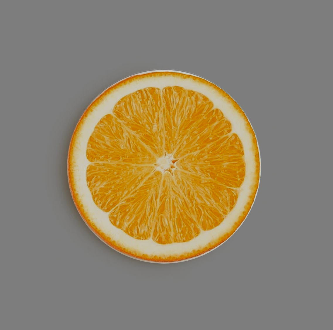
This bottled citrus brand brings together grapefruit, blood orange, and lime. The wordmark divides into eight even segments — the natural geometry of citrus cut crosswise, and the brand's core values: simple, and full of character.

Outlier Health — Eternal Balance
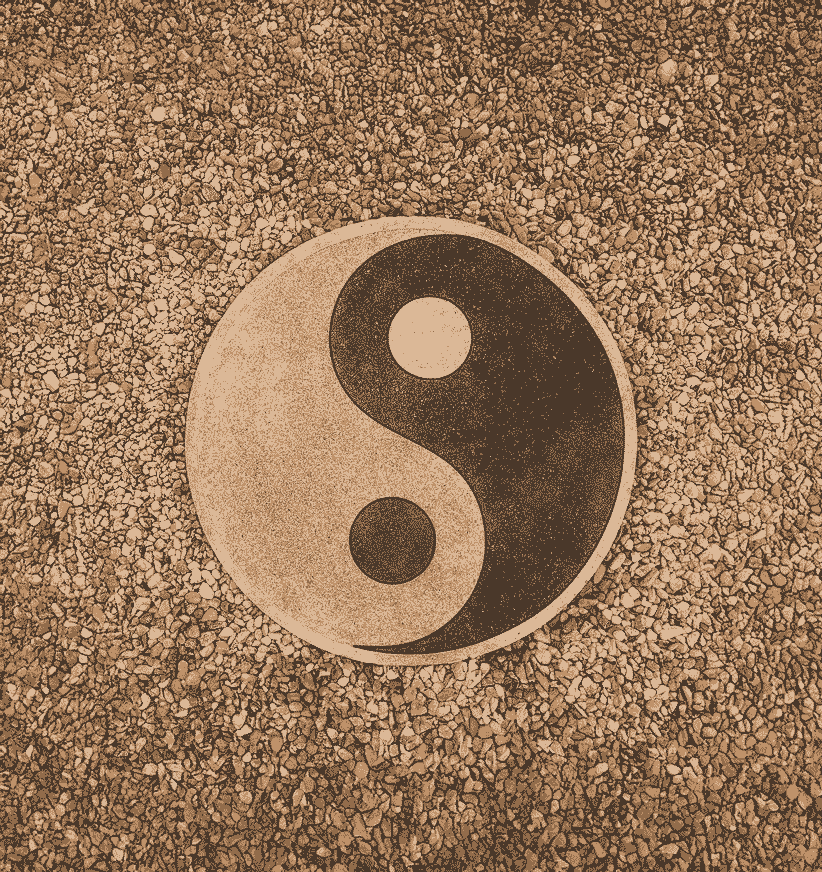
Balance sits at the heart of Outlier Medicine, a practice rooted in Eastern tradition. The logo draws from the yin-yang symbol, reinterpreted within a single letter — the "O" — transforming the brand's initial into a quiet symbol of equilibrium.

Some logos tell you everything in a glance.
The Shed — Farm to Fork
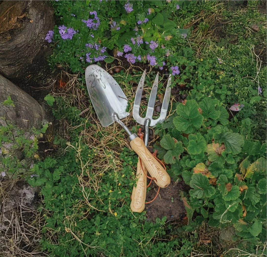
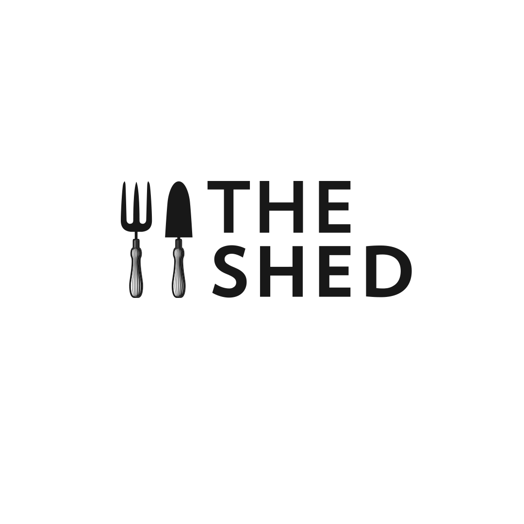
For The Shed, a farm-to-fork restaurant, the usual knife and fork symbol became a gardener's fork and trowel — tools of the soil instead of the kitchen. A quiet visual shift that reframes the whole experience: great food starts in the ground.
The Outcome
Six brands, six different problems — the same process underneath each one: listen first, reduce until only the idea is left, then shape it into a mark that feels inevitable.